Will the Fed Crush the Stock Market?
The SpaceX IPO is going LIVE today. What’s going to happen next – and does the massive hype mark the “top” for the market? Find out inside.
Big Tech Breaking Down?
The SpaceX IPO is going LIVE today. What’s going to happen next – and does the massive hype mark the “top” for the market? Find out inside.
A Dangerous Echo of the Year 2000?
The SpaceX IPO is going LIVE today. What’s going to happen next – and does the massive hype mark the “top” for the market? Find out inside.
Are You In a Crowded Trade?
The SpaceX IPO is going LIVE today. What’s going to happen next – and does the massive hype mark the “top” for the market? Find out inside.
One Pullback After Another
The SpaceX IPO is going LIVE today. What’s going to happen next – and does the massive hype mark the “top” for the market? Find out inside.
SpaceX Canceled the Pullback?
The SpaceX IPO is going LIVE today. What’s going to happen next – and does the massive hype mark the “top” for the market? Find out inside.
Does the SpaceX IPO Mark the “Top” for Tech?
The SpaceX IPO is going LIVE today. What’s going to happen next – and does the massive hype mark the “top” for the market? Find out inside.
Could the SpaceX IPO End the Pullback?
The pullback continues. But the question on people’s minds is – could the SpaceX IPO end the pullback? Ross investigates.
Could This Tech Selloff Spread to the Rest of the Market?
The tech selloff continues. Could it lead to a broader market selloff? Ross explores the situation inside.
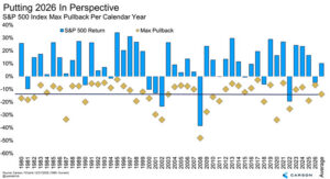
Pullback Perspective (Must Read)
Worried about the pullback? Then you need to read this as Ross’ provides valuable perspective on the whole thing.


Recent Comments