Hey, Ross here:
Let’s look at a chart that perfectly encapsulates the kind of market we’re in right now.
Chart of the Day
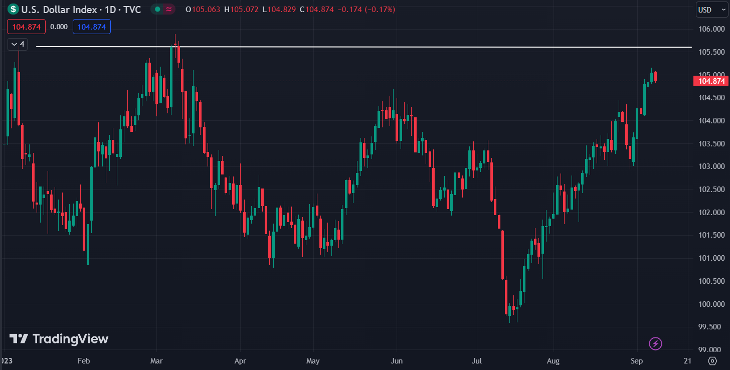
This is the DXY – the U.S. Dollar Index.
And as you can see, it has largely been inversely correlated to the stock market this year.
When the markets were going up – it was going down. And when markets were going down – it was going up.
The DXY has been rising sharply since late July – right when the stock market peaked for the year.
It’s now very close to a resistance level.
If it fails to break past that level and starts falling again – that could signal the start of the next leg upward.
Until then – stay cautious.
Insight of the Day
Good positioning happens before the market makes a big move – not after
A quick word about good positioning in trading – it’s something that happens before the market makes a big move, not after.
That’s why even though the market is currently range-bound – I’m still recommending positions, although I am a lot more cautious.
And right now, one of my strategies is up nearly 20% – counting both wins and losses – since August.
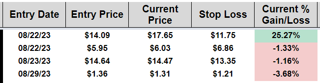
Remember – it’s all about the win/loss ratio (how much you win vs how much you lose)
It’s a strategy based on one of the most trusted chart patterns I’ve ever seen – and thrives during pullback periods.
So, if a nearly 20% return in the middle of a pullback sounds good to you…
All you have to do is click here to find out more about this strategy.
Embrace the surge,

Ross Givens
Editor, Stock Surge Daily