Hey, Ross here:
We’re almost at the end of Q3.
And after going through the market from top to bottom…
I can build you a pretty convincing bearish case.
I can also build you a pretty convincing bullish one.
Both using hard data.
Let me show you what I mean.
Chart of the Day
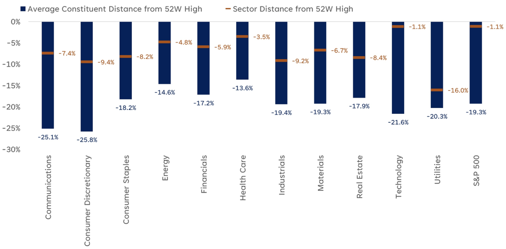
The S&P 500 itself is less than 1% from its all-time high.
But the average stock inside the index is still roughly 19% below its own 52-week high.
And some of the gaps underneath are huge.
Technology is the clearest example.
The sector itself is only about 1% below its high…
Yet the average Tech stock is down more than 21% from its peak.
Consumer Discretionary looks similar.
The sector is roughly 9% below its high…
While the average stock is more than 25% underwater.
So the headline indexes look healthy.
A lot of the stocks underneath them absolutely do not.
And the long-term breadth numbers aren’t exactly helping.
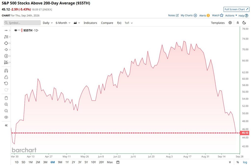
Only about 45% of S&P 500 stocks are still trading above their 200-day moving average.
In other words, 55% are below it.
That’s the weakest long-term breadth reading in roughly six months.
Now, if I stopped here…
I could make a pretty nasty case for the market.
But now look at this:
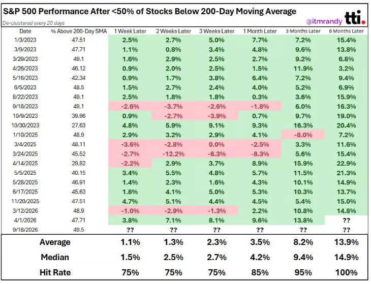
This chart looks at what happened after similarly poor breadth readings during this cycle (2023 onwards).
And despite how ugly those moments felt at the time…
They were generally followed by positive S&P 500 returns over the following months.
So weak breadth has not automatically meant “sell” during this bull market.
And there’s another tailwind arriving right now.
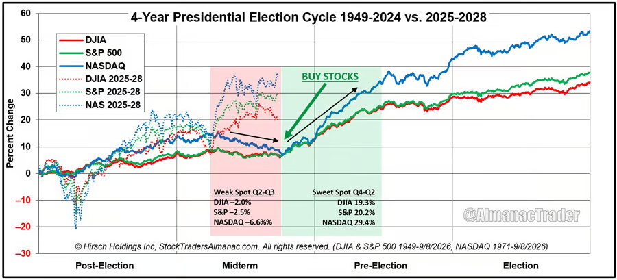
Historically, we’re entering what’s often called the “Sweet Spot” of the four-year election cycle…
Beginning in Q4 of the midterm year and extending through Q2 of the following pre-election year.
So let’s recap.
The S&P is near record highs…
But the average stock is nowhere close.
More than half the index is below its 200-day moving average…
But similar weak-breadth readings have repeatedly been followed by gains.
And just as the internals start looking shaky…
We’re entering one of the historically stronger stretches of the four-year cycle.
So which signal do you trust?
Insight of the Day
You can prove almost anything with one chart.
I could stop after the first two charts and tell you this market is hanging by a thread.
I could stop after the next two and tell you the weakness is setting up another rally.
Either argument would sound pretty convincing.
And that’s precisely the problem.
Markets rarely hand you one clean signal that tells you everything you need to know.
Breadth can look terrible while seasonality improves.
The index can sit near a record while half the stocks underneath it struggle.
A historically bullish setup can show up right alongside some very real warning signs.
The job isn’t to find the chart that agrees with whatever you already believe.
It’s figuring out which signals deserve the most weight right now…
And what they mean when you put them together.
That’s why every week I go LIVE to break down the market in real time…
To cut through all the conflicting signals, show you what I’m actually paying attention to, and explain how I’m approaching the opportunities in front of us.
I held my latest session just this morning.
So if you missed it…
Click here now to watch the full replay.
Customer Story of the Day
“Best service available, and I have tried them all.
Ross is the only one who spends his time trying to TEACH you how to do it rather than telling you buy this sell that.
It’s like the old saying, “Give a man a fish you feed him for a day, Teach a man to fish, you feed him for life.”
As a lifetime private trading club member I would Highly, Highly recommend TA to anybody, and I have recommended it to several of my friends and family.”

Ross Givens
Editor, Stock Surge Daily